
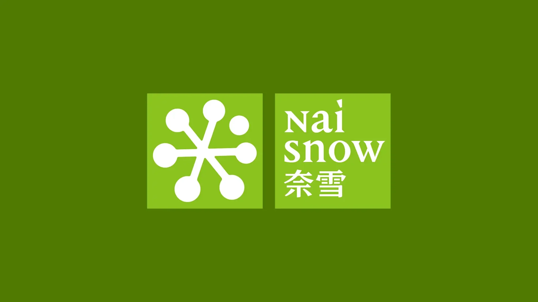
On 7 May, Naixue (Nayuki Holdings, 2150.HK) announced a full brand overhaul to mark its 10th anniversary, unveiling a new logo and changing its name. The brand’s Chinese name has been shortened from “奈雪的茶” (Naixue’s Tea) to “奈雪” (Naixue), and it now goes by a new English name: “Naisnow.” The word “Xue” means “snow” in Mandarin.
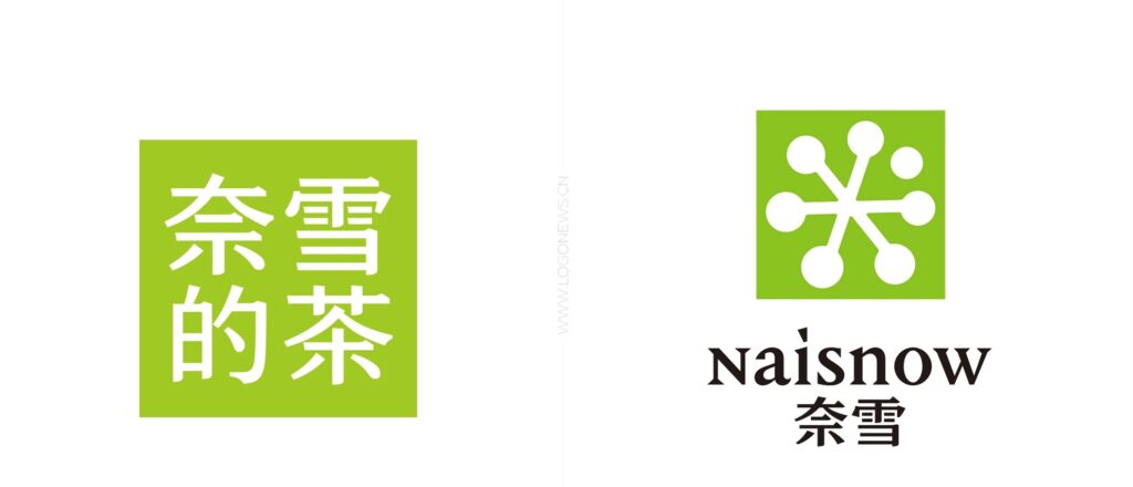
The updated logo blends snowflakes and fruit with the brand’s signature green color, meant to represent freshness and health. According to the brand, “Nai” stands for Nature, Art, and Imagination—its core values—while “snow” reflects its theme of natural purity.
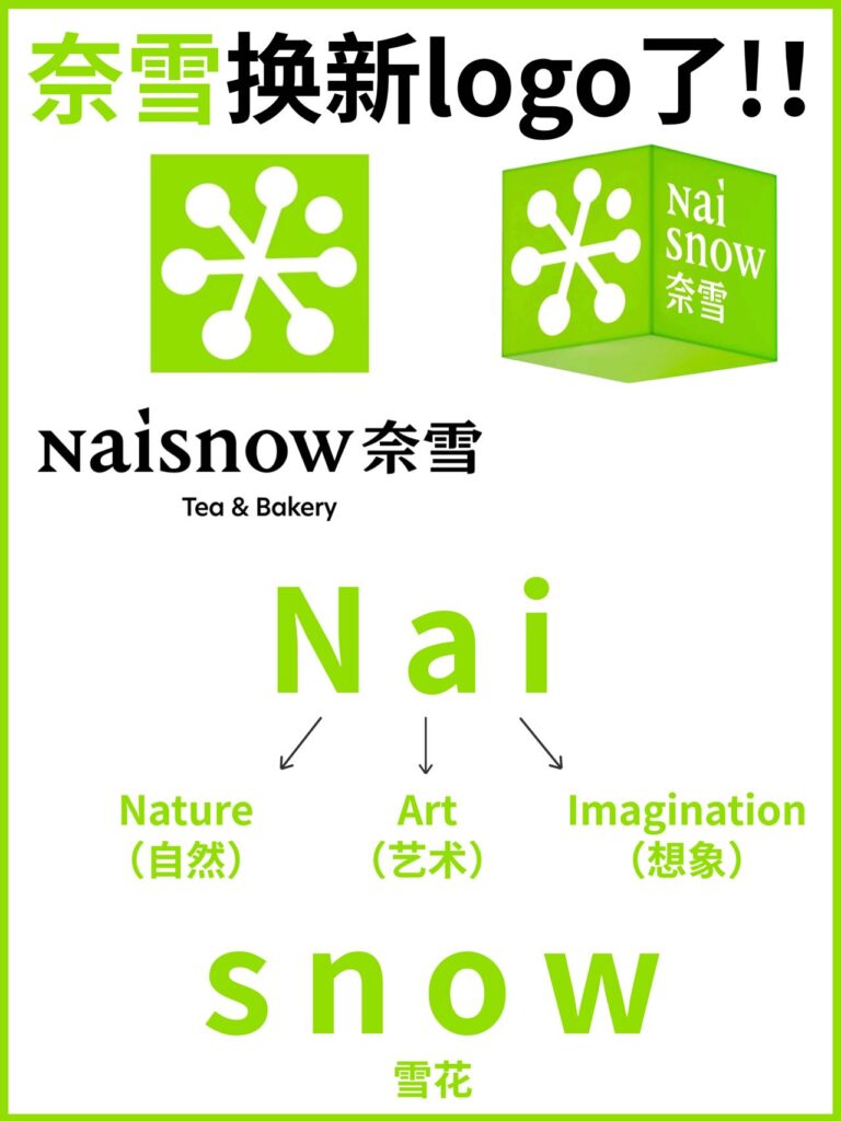
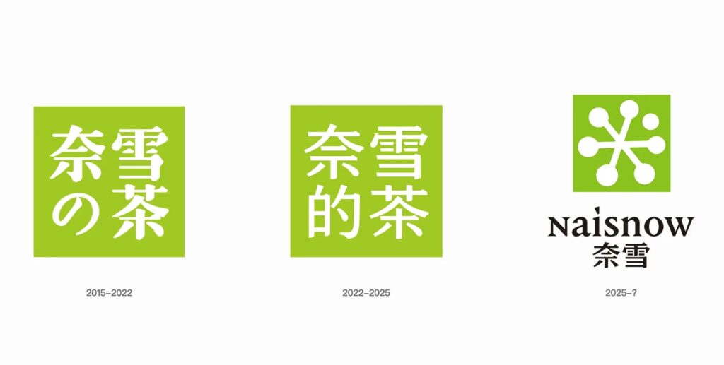
This marks the brand’s third name and logo change. Founded in 2015 as “奈雪の茶” (Nayuki no Tea, using the Japanese possessive “の”), the brand switched to the Chinese possessive character “的” in 2022 amid a push for homegrown branding and to shed Japanese elements. This latest move drops “Tea” altogether and introduces “Naisnow” as a step toward global expansion rooted in local identity.
But not everyone is on board. With China’s tea market more competitive than ever, many customers see the rebrand as unnecessary, if not confusing. Some long-time fans worry the change could weaken brand loyalty built over the years. While a few have praised the attempt to go global, most online reactions have been skeptical. Critics say the new name lacks clarity and charm. “Naisnow” has been called clunky, hard to understand for non-Chinese speakers, and awkward to native audiences. Many feel it’s a random mash-up that makes the brand feel less premium.
Need to boost your China strategy? Dao Pro delivers bespoke insights on marketing, innovation, and digital trends, direct from Chinese sources. Find out more from our Dao Strategy Team here.